Top Colors 2024
A change in color can be an immediate mood booster in any space, and a new year is a great time for a refresh. With so many options available, though, it may seem daunting to choose. Here are the top styles that paint manufacturers have chosen as their colors of the year for 2024 as a guide.
Warm and Soft
Wellness has become a key component in the home in the post-pandemic era, and creating a comfortable environment — whether through building techniques or interior design — is critical for a space where everyone can live, play and work. Paint manufacturers are taking notice, as shown by the warm, soft hues they’ve selected for 2024.
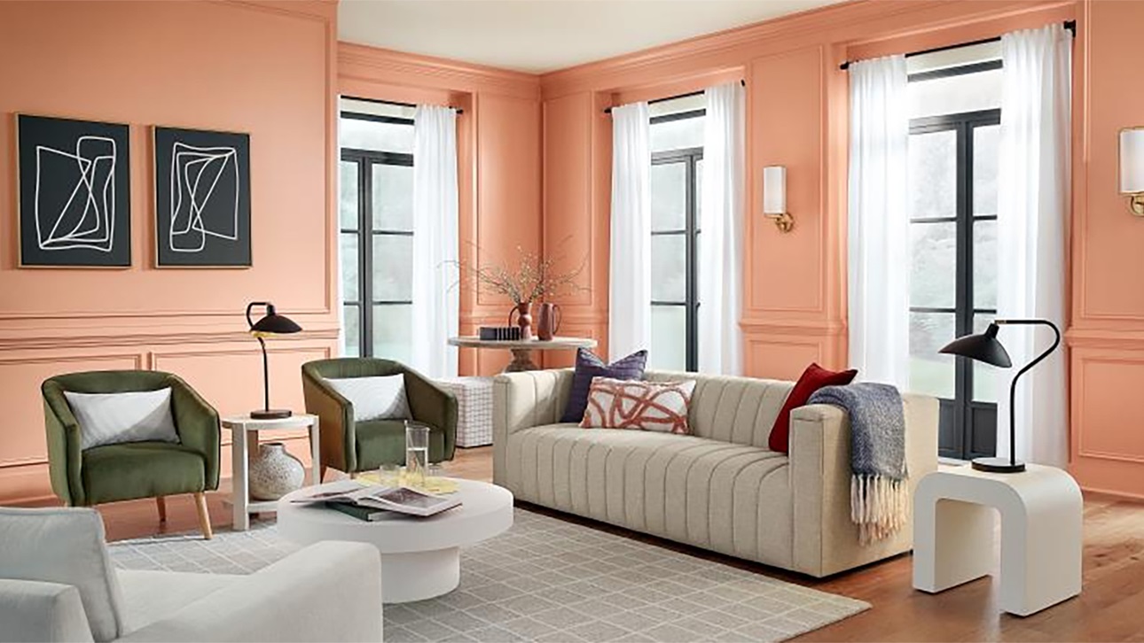
Persimmon from HGTV Home by Sherwin-Williams. Photo courtesy of HGTV Home by Sherwin-Williams
Here are some examples:
- Pantone – Peach Fuzz “is a heartfelt peach hue bringing a feeling of kindness and tenderness, communicating a message of caring and sharing, community and collaboration. A warm and cozy shade highlighting our desire for togetherness with others or for enjoying a moment of stillness and the feeling of sanctuary this creates, PANTONE 13-1023 Peach Fuzz presents a fresh approach to a new softness.”
- HGTV Home by Sherwin-Williams – Persimmon “pulls from grounded, earthy origins, to deliver a shade that feels both uplifting and refreshing. An earthy terracotta infused with tangerine tones, naturally inspired colors like perfect Persimmon are being incorporated to soften spaces and add a personal touch to the home.”
- Glidden/PPG – Limitless, “a warm honey beige hue, reflects evolving consumer preference for softer, lighter shades in everything from automobiles to architectural elements. It contains both the power of a primary color and the essence of a neutral to support both cool and warm tones. It even has the power to stand on its own. The possibilities are truly Limitless.”

Blue Nova by Benjamin Moore. Photo courtesy of Benjamin Moore.
Peaceful Blues
The idea of creating a sanctuary within the home extends to other shades as well. Many paint manufacturers look toward the blue color spectrum for their colors of the year to create a serene, uplifting environment:
- Sherwin-Williams – Upward, “a breezy, blissful blue. The color found when we slow down, take a breath, and allow the mind to clear.”
- Benjamin Moore – Blue Nova. “With Blue Nova leading the way, depth and intrigue are balanced by an undercurrent of reassurance. This alluring mid-tone features an enchanting duality, capturing the spotlight with endlessly classic appeal.”
- C2 – Thermal. “This bespoke pale yet punchy blue is poised for adventure and brimming with hope, evoking feelings of loyalty, trust, and confidence. Its contradictory nature has the dual ability to uplift us and provide a sense of calm and tranquility.”
- Dunn-Edwards – Skipping Stones “feels like a daydream and can add a sense of mystery and thoughtfulness to any space. It’s part of the resurgence of blue and represents a shift away from the bold, warm-toned colors we’ve seen gain popularity over the past few years.”
- Krylon – Bluebird “both uplifts and comforts, making it an ideal choice to complement natural tones and textures while putting everyone at ease in every room in the house.”
- Minwax – Bay Blue is a relaxing mix of blue and green “that expands our connection to water and wellness, moving beyond the growth-focused greens of recent years for a wholly immersive color experience. It invites you to interpret design anew to create a home that’s authentically personal.”
- Valspar – Renew Blue, “a nourishing, green-influenced blue that creates a sense of peace wherever you place it.”
Statement Colors
Sometimes a new year calls for a new look, with a bold shift in appearances. If a pop of fresh color is what you’re looking for, here are a few selections to help make a statement:

- Behr – Cracked Pepper, “a versatile soft black that accentuates the spaces you create life moments in.”
- Dutch Boy – Ironside, “the perfect backdrop for showcasing furniture, art and accessories. It brings an allover sense of sophisticated comfort to our 2024 Color Trend palettes – Embrace, Retreat and Inspire.”
- Rust-Oleum – Chocolate Cherry, a response “to our consumers’ need for a color that not only stands out but also provides a sense of authenticity. As neutral tones take a backseat, ‘Chocolate Cherry’ steps forward as a champion of uninhibited living.”
This story originally published on NAHB.org.